[LOGO] CHOROY
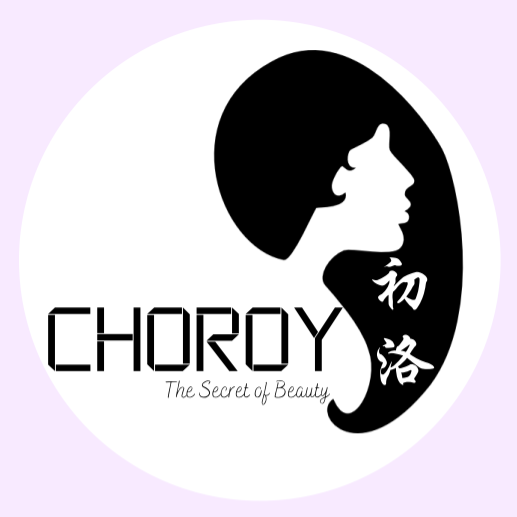
Logo design for my very first business collaboration – a Jewelry Online Shop, co-founded with friends.
I was thrilled to have the opportunity to design the logo for our brand. The concept was inspired by two key ideas: purple, a color we love for its elegance and mystery, and a feminine figure, representing our target audience—girls and women who cherish beautiful accessories.
— Design tool used: Canva
[LOGO] CHOROY SANCKS
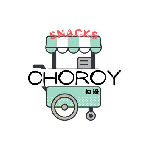
CHOROY SNACKS – our second business venture, transformed from our original Jewelry Shop into a snack shop.
For the logo, I chose a trolley icon to symbolize a fun and interactive shopping experience—just like pulling a trolley through a physical store, customers can explore and “walk through” our shop virtually, filling their cart with their favorite snacks. It represents abundance, convenience, and the hope for a prosperous business.
— Design tool used: Canva
[LOGO] Ah So TauFa
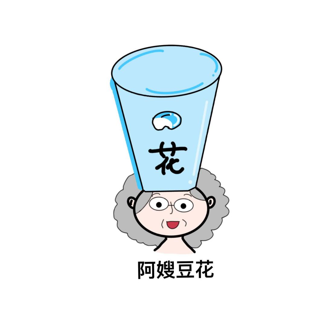
Ah So TauFa – a fun, spontaneous design inspired by one of my favorite desserts.
This design came to life during my free time, sparked by my love for taufa (tofu pudding). One day, I imagined an aunty selling taufa—just like the ones I used to see at the night market back in my hometown. That memory became the heart of the concept. I incorporated a cup, an aunty figure, and a bean into the design, each element symbolizing the warm, homemade feel of traditional taufa.
— Design tool used: Procreate
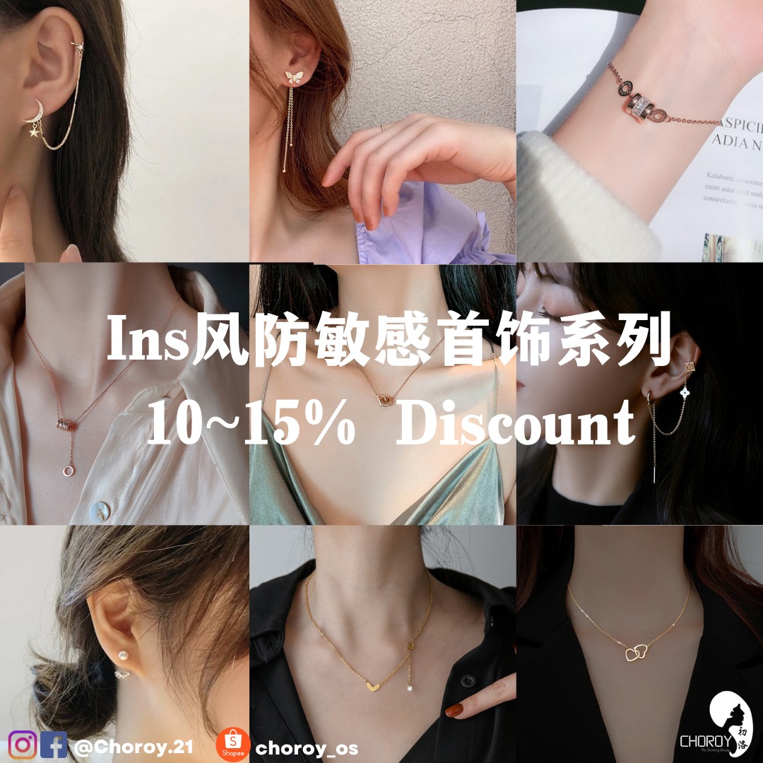
[POST] PROMOTION
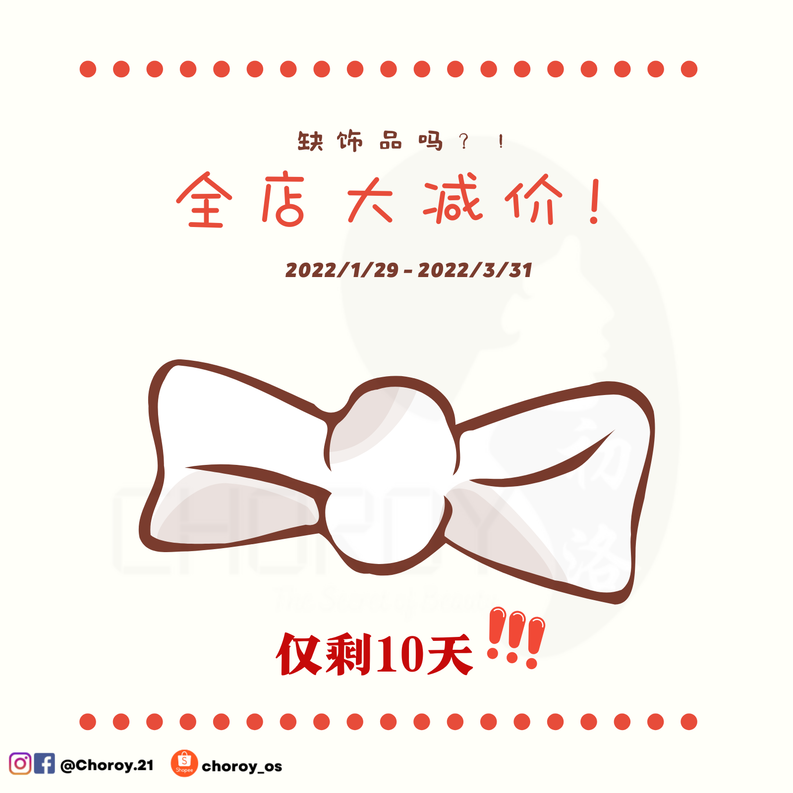
Jewelry Online Shop Promotion Design – Created for a social media post to promote an event.
I designed this promotional photo to catch the eye of our clients on social media. The concept features a ribbon, symbolizing accessories and elegance, as the centerpiece of the design. For the background, I chose warm colors, aiming to create a comfortable and inviting atmosphere for clients as they browse the post. To highlight key information, I used different shades of red to draw attention to the important details, ensuring that the main message of the promotion stands out clearly.
– Design tool used: Canva
[POST] LISTING FRAME

CNY Promotion Listing Frame Design – Created for product covers on Shopee and social media pages.
This design was made to highlight the CNY promotion event, using traditional elements like red, 舞狮 (lion dance), 春 (spring), and 梅花 (plum blossoms) to capture the festive atmosphere of Chinese New Year. The goal was to clearly communicate that the promotion is exclusive to CNY. Additionally, I focused on ensuring the consistency and neatness of the listing, making it visually appealing and easy for customers to recognize the event.
— Design tool used: Canva
[POST] BIZ COMPLETION
Design for Clearance Promotion – Created using image stitching, layer overlay, and text insertion.
This design was crafted as a promotional graphic for a clearance sale. I combined multiple images from the product showcase to give viewers a better understanding of the ongoing jewelry clearance event. To enhance readability, I added a semi-transparent black overlay (with lower 50% opacity) on the top layer of the image. This helped maintain the visibility of the images underneath while ensuring the white text stands out clearly.
— Design tool used: Canva
[POSTER] PROMOTION
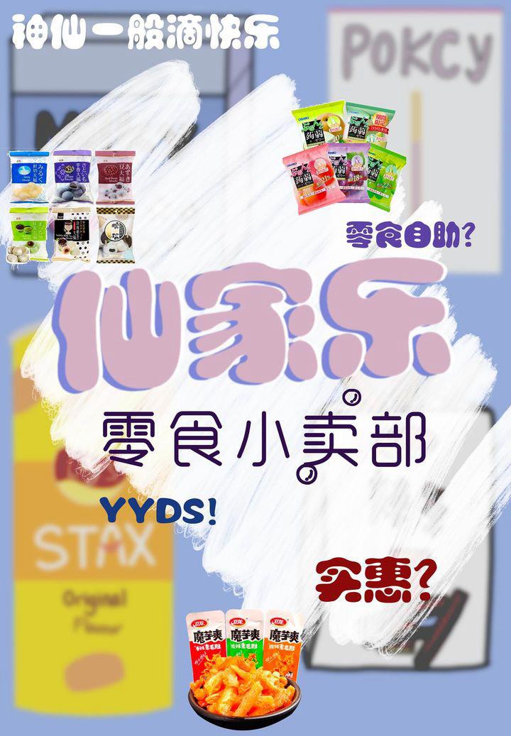
Poster Design for a Friend’s Stall Opening – Created as a promotional poster for a snack stall.
For this design, I used hand-drawn snacks as the background and applied a blur effect to ensure the elements in the foreground stand out. I incorporated brush strokes to highlight the key features and used shadow layering to make the stall name more prominent. To make it clear that this is a snack stall, I added additional snack-related elements. I also included popular internet phrases like YYDS (which means “amazing!”) and 零食自助 (referring to “snacks buffet”) to resonate with the audience. This design was done free of charge, without any fees for the work.
— Design tool used: Procreate
[POSTER] MENU
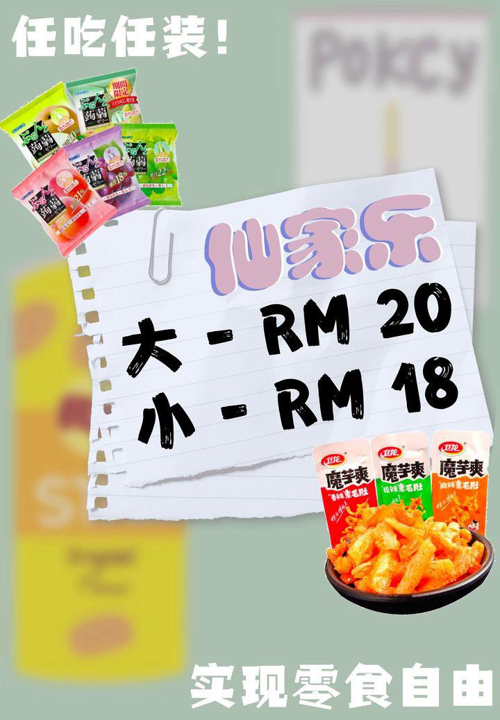
Menu Poster Design for a Friend’s Stall – Created for a snack stall menu.
To maintain consistency with the previous design, I used hand-drawn snacks as the background and applied a blur effect. This design incorporates text strips, where the prices and signatures are placed, creating the look of text written on paper. I also added some snack elements to make it clear at a glance that the stall sells snacks. Staying with the same idea as previous, I included popular internet phrases like “实现零食自由” (referring to “unlimited snacks”) and “任吃任装” (which translates to “fill your bag with unlimited snacks”) to explain the stall’s selling concept in a fun and engaging way.
— Design tool used: Procreate
[LAYOUT] COMPREHENSIVE
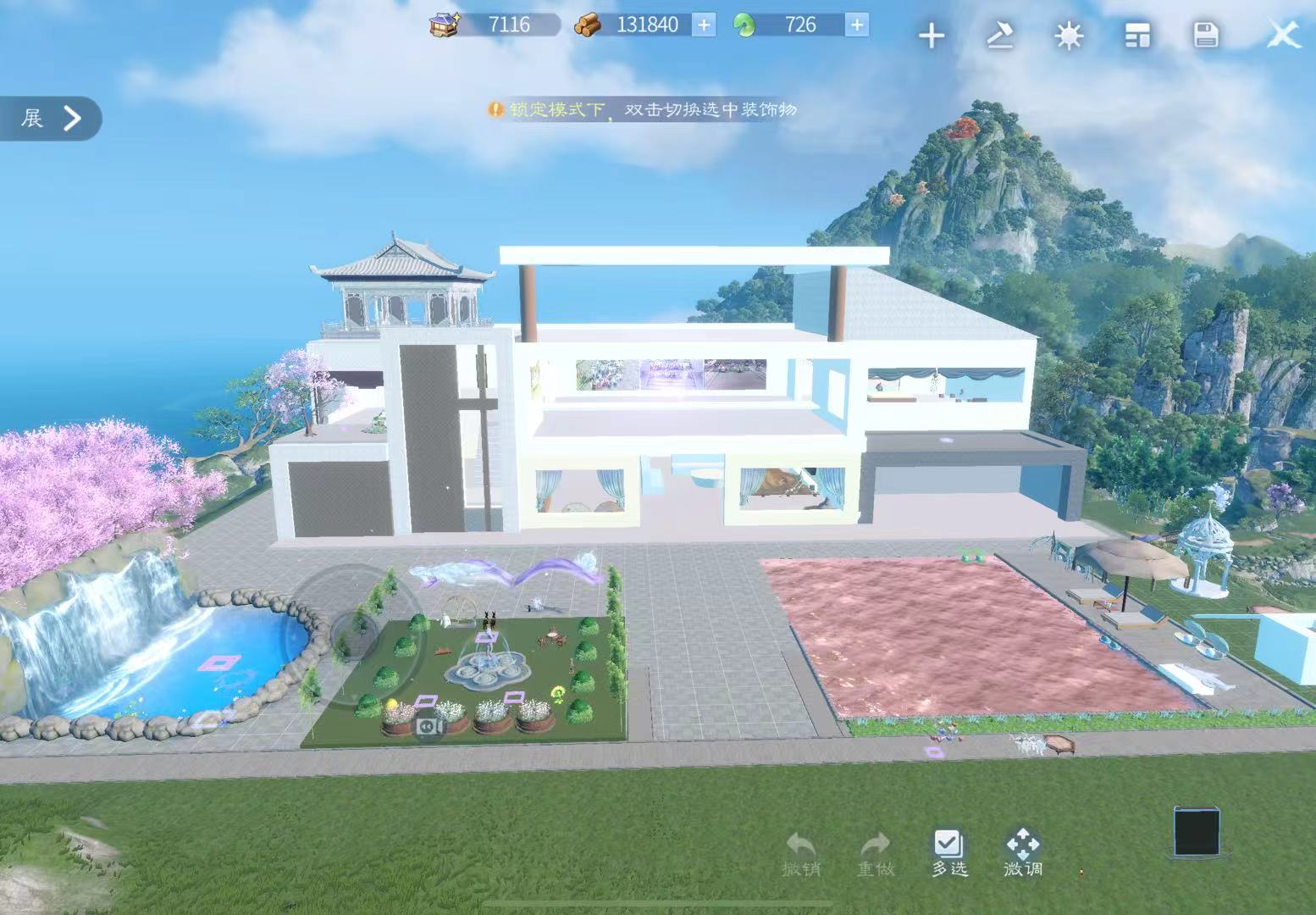
Dream Home Layout – A conceptual overview design of my in-game home.
This is a work-in-progress layout created within 倩女幽魂手游 (by NetEase), showcasing the overall concept of my custom-designed home. Inspired by modern architecture, the design features elements such as a swimming pool, garden, waterfall, and a villa-style house, all combined to bring my dream home to life in the virtual world.
— Design tool used: 倩女幽魂手游 家园3.0(浮梦新居)
[LAYOUT] WATERFALL
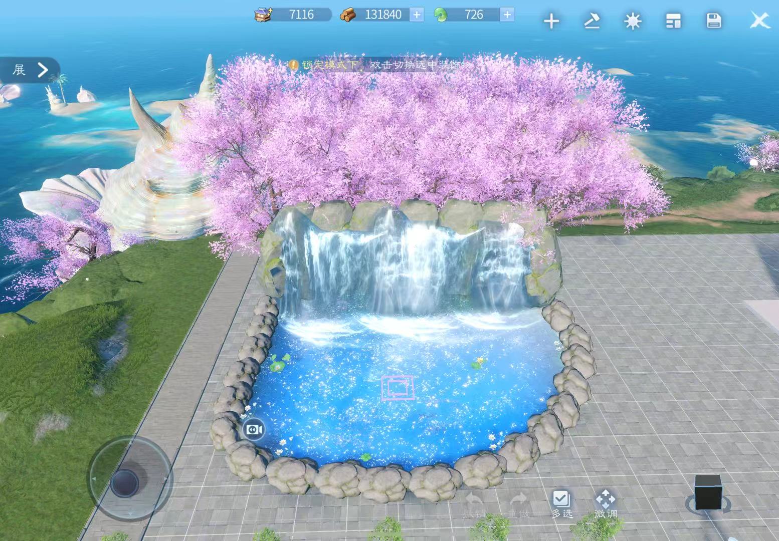
Fantasy Waterfall Design – A handcrafted dreamlike scene within the game.
This design features a man-made waterfall, brought to life with dreamy and delicate details. Behind the large rocks, I placed pink cherry blossom trees to add a soft, romantic touch. Using the in-game terrain tools, I carved out a small lake and filled it with clear water, then added swimming fish, waterfall effects, and rippling water animations to make the entire scene feel more vibrant and alive.
— Design tool used: 倩女幽魂手游 家园3.0(浮梦新居)
[LAYOUT] GARDEN
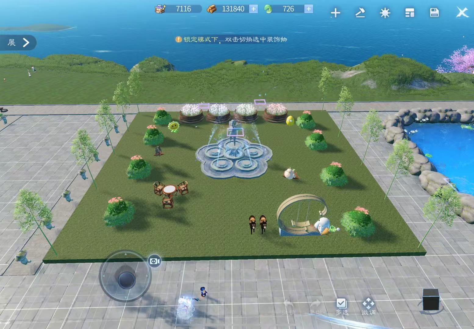
Cozy Garden Retreat – A relaxing, family-friendly garden design.
This is a leisure-style garden designed for comfort and tranquility. At the heart of the garden stands a fountain, serving as the central feature, surrounded by flower beds, and shrubs. The space is decorated with tables and chairs for playing cards or enjoying tea, a wooden horse, and other adorable ornaments, creating a warm and inviting atmosphere. Near the entrance, I added rideable donkeys and a swing set, perfect for both adults and children. To bring the garden to life, I also placed fluttering butterflies above the flower beds, adding a sense of movement and natural charm.
— Design tool used: 倩女幽魂手游 家园3.0(浮梦新居)
[LAYOUT] BEDROOM
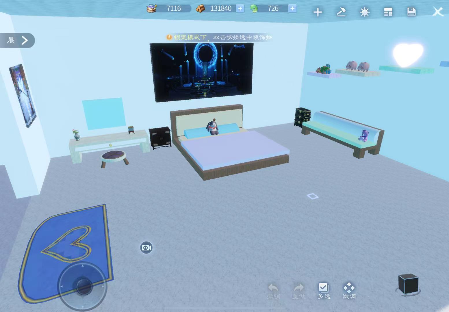
Sky Blue Bedroom – A cozy and elegant personal space built with creativity.
This indoor bedroom is designed with a sky blue theme, radiating a sense of comfort and elegance. The walls are adorned with photos and decorative pieces, giving clear hints about the personality of the room’s owner. On the bed, there are beloved plush toys and favorite bedding, adding a personal and heartwarming touch. Next to the bedside, there’s a vanity table and chair, completing the functional layout. What makes this space even more special is that most of the furniture and structure are built using block-like pieces, allowing for full customization based on personal style and imagination.
— Design tool used: 倩女幽魂手游 家园3.0(浮梦新居)
[LAYOUT] KITCHEN
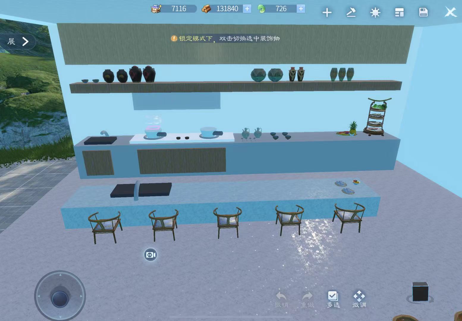
Modern Indoor Kitchen – A cozy, customizable cooking space built from creativity.
This indoor kitchen embraces a modern style, featuring wall-mounted cabinets, a stove, and a sink. It’s equipped with various pots, dishes, and even some prepared food and seating, creating a space where one can cook comfortably and efficiently. The theme color is a soft yellow, chosen to evoke a sense of warmth and spaciousness. However, due to overlapping shadows from layered building blocks, the intended color may not appear as prominently. Most of the kitchen was constructed using modular building blocks, making it highly customizable to match personal tastes and imagination.
— Design tool used: 倩女幽魂手游 家园3.0(浮梦新居)
[AI GENERATED] SCENE
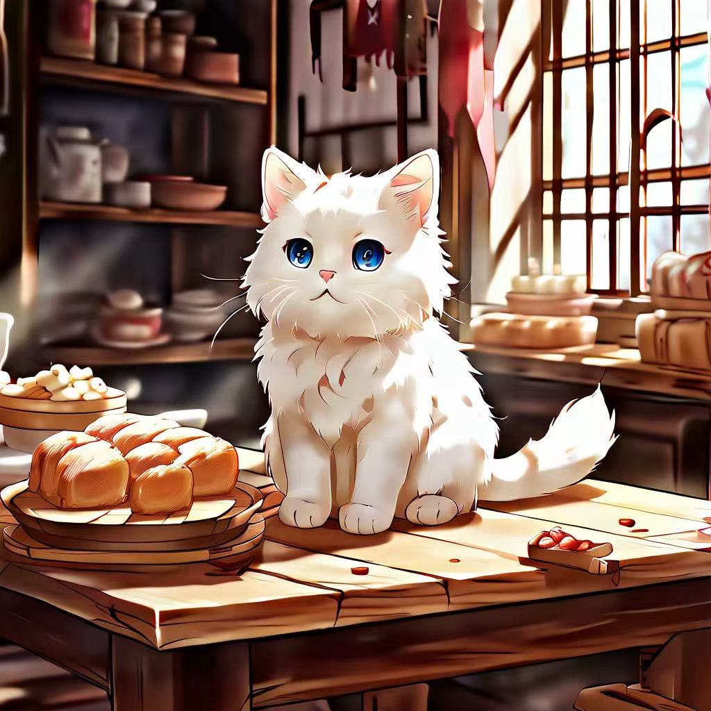
AI-Generated Kitchen Image – A soothing café scene featuring a white cat.
This image was created using AI Stable Diffusion with the prompt specifying a white cat in a kitchen setting, aiming for a healing atmosphere and an anime style. While the final result slightly diverged from the original instructions, it still captures the overall essence and mood described, with a calm and cozy vibe that aligns with the intended feeling.
— Design tool used: Stable Diffusion
[AI GENERATED] FEMALE
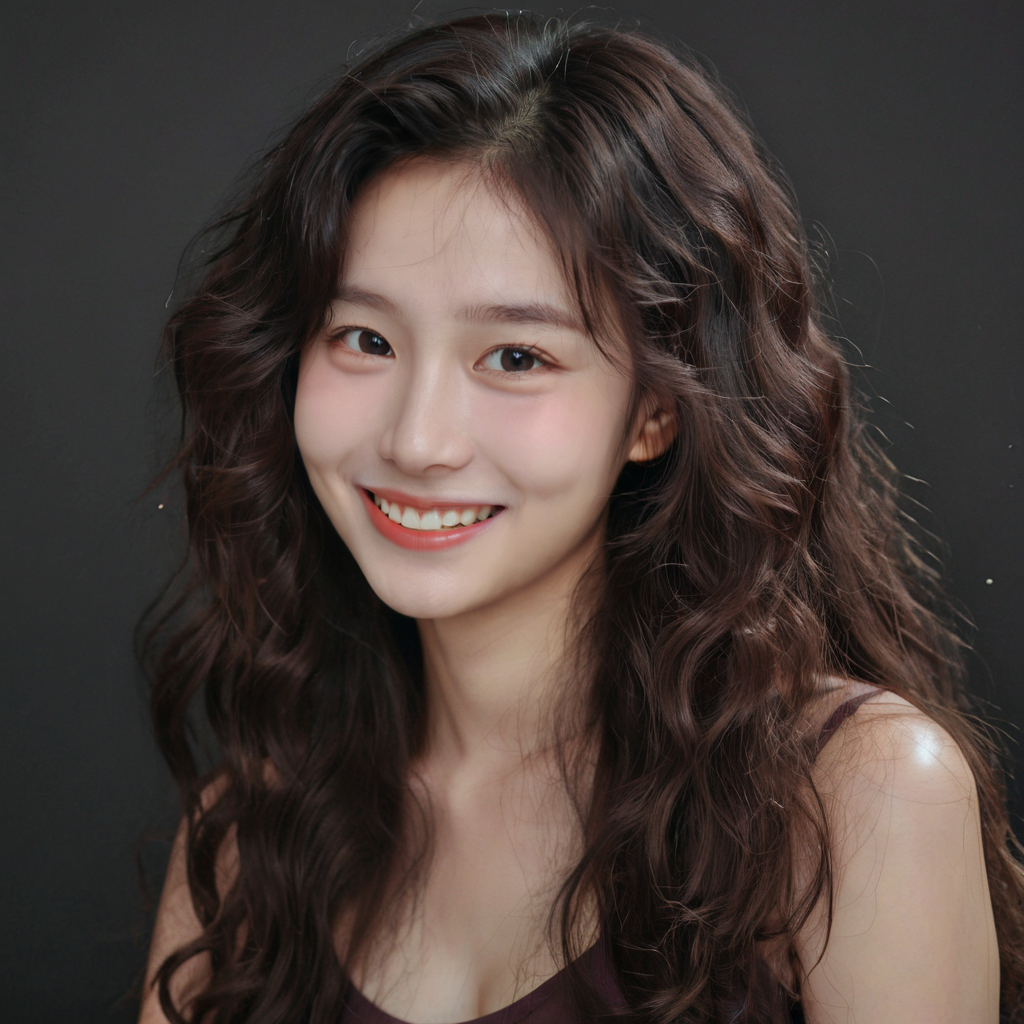
AI-Generated Character Image – A smiling, strong woman.
This image was created using AI Stable Diffusion based on the prompt to generate an Asian girl with curly, long hair, a sweet, gentle smile, and a warm, friendly demeanor. This character design reflects my impression of a character for a novel I’m writing – someone who embodies a sunny, strong personality. The image perfectly aligns with the description, capturing the essence of a confident and cheerful woman.
— Design tool used: Stable Diffusion
[AI GENERATED] MALE
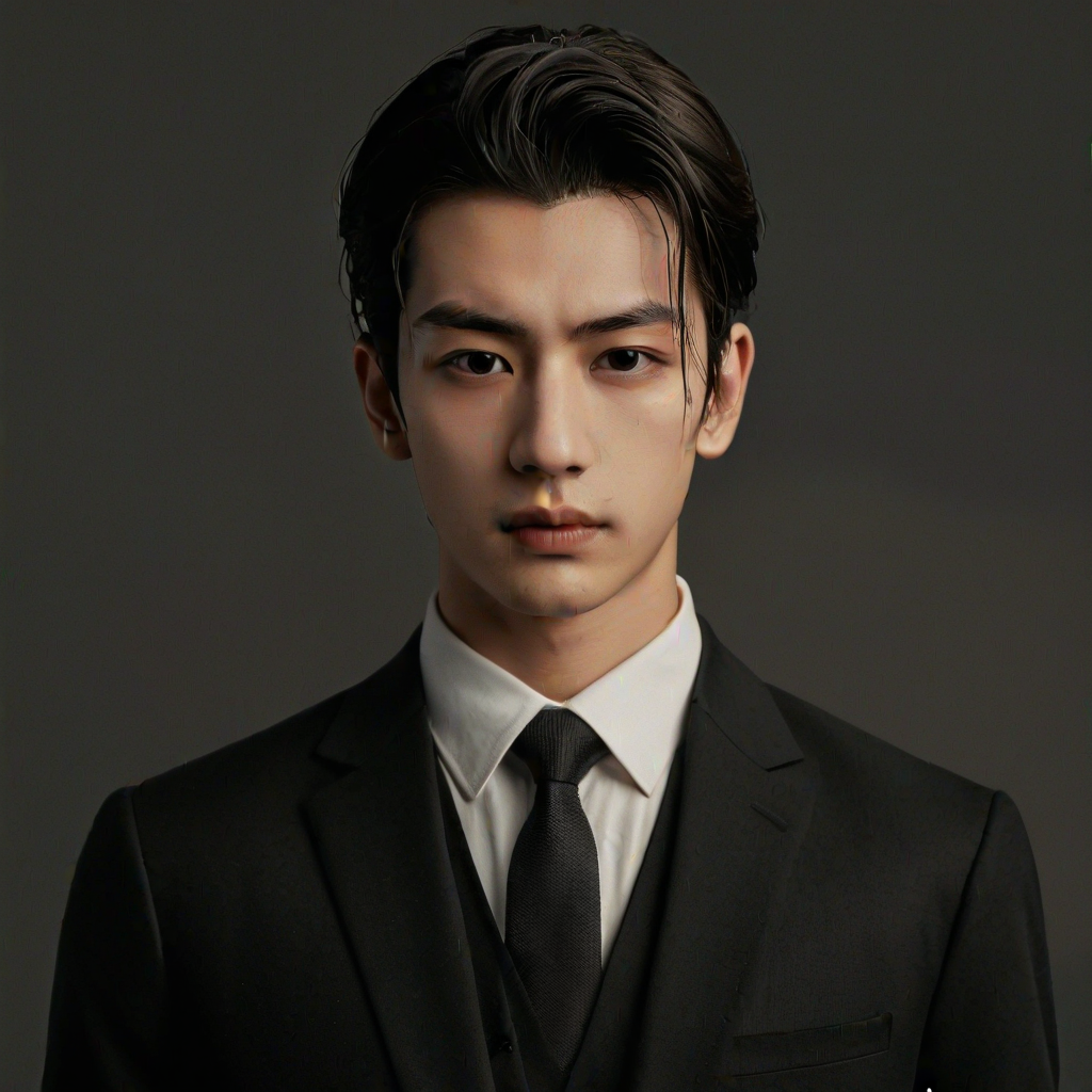
AI-Generated Character Image – A cool, business-savvy man.
This image was created using AI Stable Diffusion, based on the prompt to generate a mixed-race man, depicted as a CEO with a cold expression and defined features. This design aligns with my vision of the character for a novel I’m working on – someone who is career-driven, and exudes authority. Although there are some minor imperfections in the image, they don’t affect the overall portrayal of the character.
— Design tool used: Stable Diffusion